22.02.2026 19:52
Incident Reporting: EU-Wide Statistics
At the last CSIRTs Network meeting we got treated to a powerpoint versions of the statistics that ENISA publishes under https://ciras.enisa.europa.eu/
The mathematician inside me was not impressed, and as I’m prone to do, I did not withhold my opinion. This blog post explains why I’m so unhappy with ENISA’s analysis.
Timeline
First, let’s look at the overall timeline:
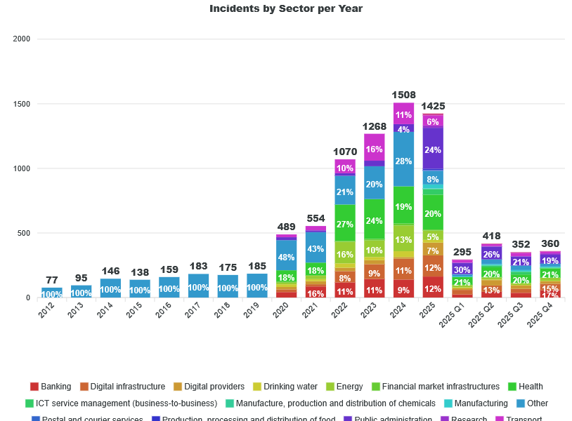
What’s wrong here?
Axis linearity
Most of the vertical bars cover the timespan of a year, whereas the last 4 cover only quarters. This messes up the intuitive understanding of the diagram in two ways:
- The x-axis is not covering time in a linear way
- You can’t compare the heights of the last 4 bars to the ones from before – you’re best off ignoring them as the full year 2025 is also in the graph.
As I’m creating similar graphs for the Austrian data, I can sympathise with the quest of doing both long-term statistics as well as conveying detailed data from the recent months. My solution is the following:
- Do a purely yearly graph for the long-term view of the overall numbers. If the last year is partial, that’s ok. People understand that. I sometimes think it might be worthwhile to scale up the last year and draw it shaded, just to indicate where the full year will land if the reporting rate stays the same.
- And have a second graph covering the numbers per month, reaching back 6 to 18 months. That would also work with quarters.
“Other”
The first 8 years cover only incidents in the sector “other”. If I’m not mistaken, these are all reports that were collected via the telecommunication regulation. Only with 2020, NIS1 kicked in and we see the first reports from the NIS sectors.
So, if CIRAS is aggregating NIS reporting with other regimes like DORA and Telecoms, then please label the data as such. It looks a bit like we’re mix and matching data received due to different regulations.
Impact of Regulations
One important piece of information for us here in Austria is the effect of NIS2 on the number of reports we can expect when the NIS2 transpositions goes live later in 2026. These diagrams do not give us any indication what to expect. The reason is that the NIS2 transpositions in the EU Member states did go live at the same moment: that process is still ongoing. Thus, the expected jumps in reports have happened (or will happen) at different moments in time, thus their effects are smeared over more than two years in this diagram, completely obscuring their effect.
Recommendation: create a diagram where the X-axis is not the calendar year, but months after NIS2 went live in each MS. I’d also use thin lines to show each MS’s data (not labelled, I we can’t disclose individual numbers) and a thick line (or bars) for the overall data.
Do the same for NIS1.
Root Causes
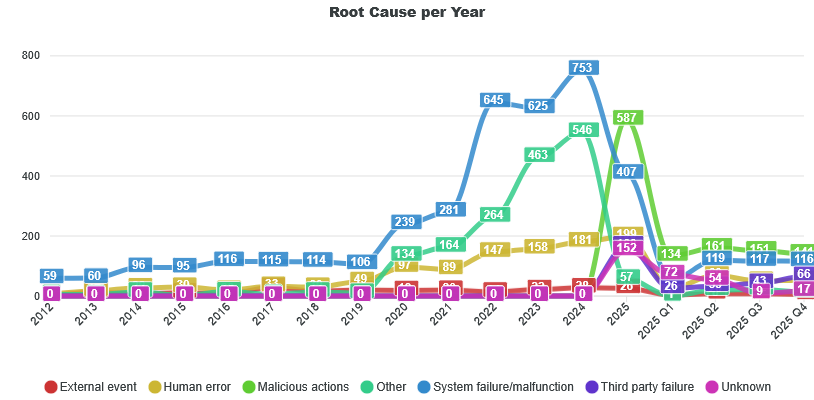
This development is wild. For a long time, “System Failures” completely dominated “Malicious Actions”, That’s also what I see in the NIS1 data from Austria, and what I heard from a few colleagues I asked during the meeting. But in 2025, "Malicious Actions" suddenly overtook "Malfunctions". So, what’s going on?
This is where the graphs provided by ENISA simply give no answer, and where the presentation from ENISA did also not provide any insight.
Imagine you're doing statistics in the health sector, aggregating data from hospitals. For years on end, the root cause for emergency treatments were accidents by a huge margin, but last year that changed to 50% intentional violence. If you presented data showing that change in a press conference without further explanation, you would be crucified. And rightfully so. This is such a significant change in the trend, that it must trigger a second look. Is this change only happening in one city, oder the whole country? How much is this shift in data a result of changes in reporting processes? Is this harmless, e.g. we're now including data that we previously did not include in the reporting, or was there really a huge increase in violence in our country?
What I see in our NIS1 data is that the voluntary reporting shows a much higher rate of malicious activity than mandatory reporting. So it would be interesting to see the cross-tabs of “Incident” / ”Significant Incident” with the root case.
Is this switch in root causes also related to the implementation of NIS2? Probably yes, but with the published data, we don’t know. Is there a geographic or sectoral tilt? Also not covered.
Uniformity of Reporting
This brings me to a question which the data published by ENISA completely side-steps: Are there systematic differences in how the different member states report incidents?
I’ve heard from a mid-sized MS that their reporting numbers are pretty low - even less than what Austria is reporting. If a small MS just set very low thresholds or managed to convince their entities to voluntarily report small issues, then they might completely drown out the numbers of some larger states.
We might have a systematic statistical problem at our hands.
If the way MS implementing reporting is really diverging a lot, then just adding the absolute numbers together is a rather pointless exercise. The results will be misleading.
What is really needed here is some statistical analysis that looks at what patterns are universal across the EU and where do we have outliers. Optimally, you would plot the result on a map, but if we cannot publish country-level breakdowns, then we at least can give statistics on how certain parameters are distributed across the 27 MS. For example:
- Reports (by type) per time scaled by population size
- Ratio between “Incidents” and “Significant Incidents”
- Distribution between sectors
- Distribution of root causes (divided out by Incident type)
If the NIS implementation were uniform, there should only be minor, explainable differences (more Banks in LU, more digital service providers in NL, etc.). Anything major, which cannot be explained by delays in NIS2 transposition, should trigger a manual investigation.
We don’t necessarily need a uniform implementation of incident reporting. But we need to be aware if that’s not the case and what that means for policy decisions based on the numbers from CIRAS.
As they stand right now, I don’t think they are fit for decision making.